TripCollab
Making trip planning with friends, argument free.
Role
In this project, I designed the main interactions within the application as well as ideating the application’s main functions.
Outcome
A prototype of a conceptual mobile application that allows friends to plan trips in a fun and easy way.
Project Teams
Isabelle Louie, Nick Spanos,
Bryan To
Duration
7 weeks (Oct – Dec 2021)
Tools
Framer, Figma, Adobe CC
Context
TripCollab is a conceptual application created as part of a project for our interface design class at Simon Fraser University.
A solution that allows multiple people to vote and decide on places to visit during a trip.
Trip Planning Made Simple
Create a trip plan or join an existing plan. Invite your friends to collaborate
Collaborate with Others
Suggest places to visit during your trip. Vote on your friend’s suggestions.
Keep Track of your Travels
Check off the places you’ve visited with the built-in checklist.
Initial Proposal
Finding a target audience and basing the app concept on common pain points.
We aimed to identify opportunities to address the needs of our target audience, business travellers looking for a work-life balance. Through user research and interviews, we created a persona and generated app ideas, keeping in mind design requirements. My idea was a mobile travel guide with tailor-made recommendations for quick bites and sights.
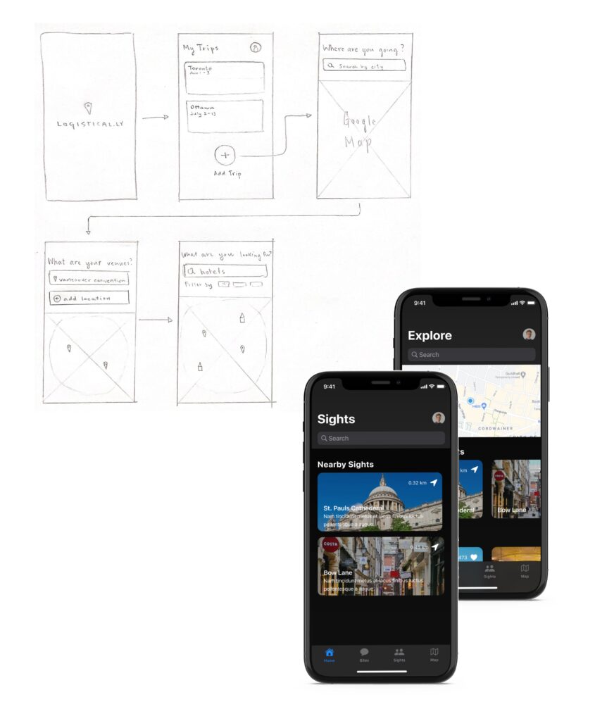
Initial app proposal ideas sketched out and imagined, with the bottom right layout being my rough wireframe.
Sketching
Mapping out interactions and layouts.
After selecting our idea, we created a storyboard to map out the app’s interactions, inputs, outputs, and sensors. We combined our ideas to create an app that provided trip planning and suggestions in one place, with a focus on using Maps API to make planning easy for our persona, Natalia. The app generated an itinerary that Natalia could share with her colleagues.
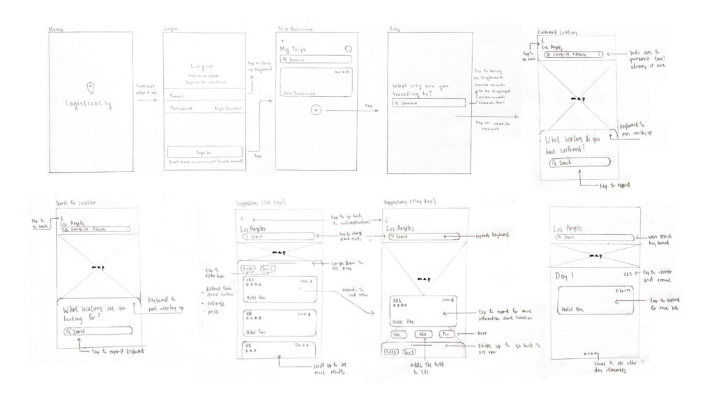
Initial sketches of the application layout. The bottom row of sketches are my own.
Reframing
The direction we had chosen for our application was already too entrenched in the market.
Based on the critique we received in the previous week, we recognized that the direction we had chosen for our application was already too entrenched in the market to see any kind of real success, so we set out to redefine what our app could offer for a different demographic.
Our refined idea focused on providing users with a collaborative platform to plan trips with friends by adding suggestions for places to visit and voting on suggested locations so every member in the group can share their input.
Stakeholders
We shifted our target audience to leisure travellers, specifically young adults ages 18-26, who enjoy traveling with groups of friends.
Through external research, we found that a lot of relationships start to show cracks during trips, with many of the catalysts originating from the trip planning process.
67%
have argued with a travel companion as a result of stress caused by planning or taking a vacation.
– Based on U.S. travellers, Report by Wyndham Vacation Rentals, 2017
41%
get stressed about scheduling things to do during their trip.
– Based on U.S. travellers, Report by Wyndham Vacation Rentals, 2017
67%
of vacationers have become stressed due to ‘information overload’ and are paralyzed with too many choices when researching and planning.
– Based on U.S. travellers, Report by Wyndham Vacation Rentals, 2017
Opportunity
How can we make trip planning with friends easy and argument-free.
Wireframing
Reframing the concept and creating preliminary wireframes.
After creating the storyboard, we reshaped the user flow based on a style guide that we created together. The style guide included design elements such as typography, colour palette, and layout guidelines to ensure consistency across the app’s different screens and features.
As part of the group effort, I designed an interface that aimed to be simple and playful but also conveyed a sense of sophistication.
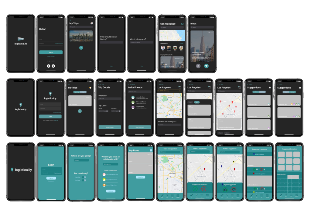
Preliminary wireframes of the application. The top row of wireframes are my own.
Prototyping
Consolidating each team member's designs into one consistent interface, using the best aspects from each design.
This prototype featured a fully fleshed out user flow, a refined interface design, micro interactions for specific actions, and an integrated use of a Maps API.
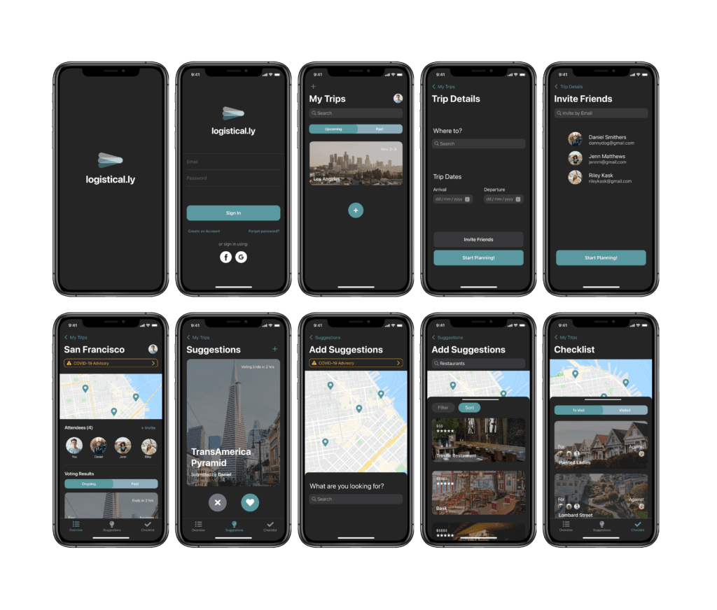
First functional prototype of the application.
User Tests
Sketching and ideating as a team.
We tested our design by conducting a user study to determine whether Logistical.ly’s user flow was effective and logical in the hands of new users. Based on the data we collected, we created an improvement plan for our final design, specifically focusing on incorporating clearer visual cues, conveying more feedback through microinteractions, establishing stronger hierarchy within our interface, and providing more context to the our key features through the use of microcopy.
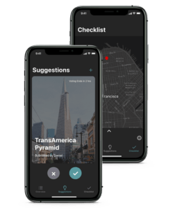
A refined version of the Suggestions and Checklist tabs based on user feedback.
Finalization
Using microinteractions to enhance navigation.
In the final stage of development, we decided to change the name of our application from Logistical.ly to TripCollab to better reflect as the previous title did not match the content of the application as well as it could. In terms of changes, the focus was towards better clarity for certain pages and microinteractions so the user would feel no uncertainty when using TripCollab. The end result is a seamless, interactive planning experience that follows the users journey from the start of the plan until the end of the trip.
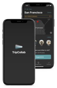
A mockup of the final design of TripCollab.
Website
Creating a website to showcase core features.
To showcase TripCollab, we designed and coded a company website. Visitors are able to learn about the different features TripCollab offers. They are also able to view a guided walkthrough of the application interface.
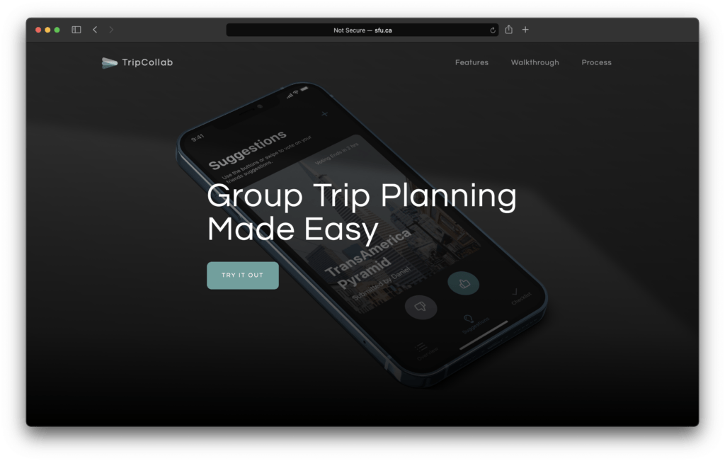
A screenshot of the TripCollab website.
Conclusion
It's okay to restart and switch ideas.
During the development of TripCollab, we engaged in a rigorous ideation process that involved the exploration of multiple concepts. With input from both peers and teaching staff, we even restarted the project. This experience reinforced my belief in the importance of trusting the design process and prioritizing user feedback. While the creation of TripCollab had its challenges, collaboration and user feedback proved instrumental in the development of an application that caters to the needs of its users. The project afforded me the opportunity to hone my skills in concept development and the creation of high-fidelity interfaces tailored to specific audiences.